
Motivating busy people to exercise + collecting experimental data.
OVERVIEW / How much does exercise benefit us? Prior research has shown that regular exercise not only makes us happier and healthier, but also makes us smarter. I helped a team of Dartmouth psychology researchers build Fitwit to tackle the question: just how long after working out are the effects of physical activity optimized? The app is for an experimental research design and is currently being used on study participants.
PROJECT DETAILS / Summer 2019 visual and UX designer
with Varsha Iyer, Henry Foster, Faustino Cortina, Julian Grunauer
for Professor Bucci, Department of Psychology at Dartmouth
01 / 04
EXPERIMENTAL VALIDITY
CHALLENGE: GETTING USERS TO FOLLOW EXPERIMENTAL PROCEDURE PRECISELY
The FitWit experiment necessitates up to four user states within a given day:
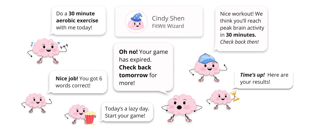
State 1: User prompted to exercise for x number of minutes
State 2: User waits for a x amount of minutes between exercise and testing
State 3: User prompted to play game before it expires in x amount of minutes
State 4: User has completed all of these tasks
These many requirements for users/study participants made designing a cohesive home screen one of the biggest challenges in this project.

My early sketches of the home screen… needless to say, I was overwhelmed.
In early mock-ups, our home screen looked rather inconsistent. In fact, Brian (the Brain) — our app’s character guide — was the only thing tying the screens together:

As you can see, this iteration looks like it could be a compilation of home screens from four different apps!

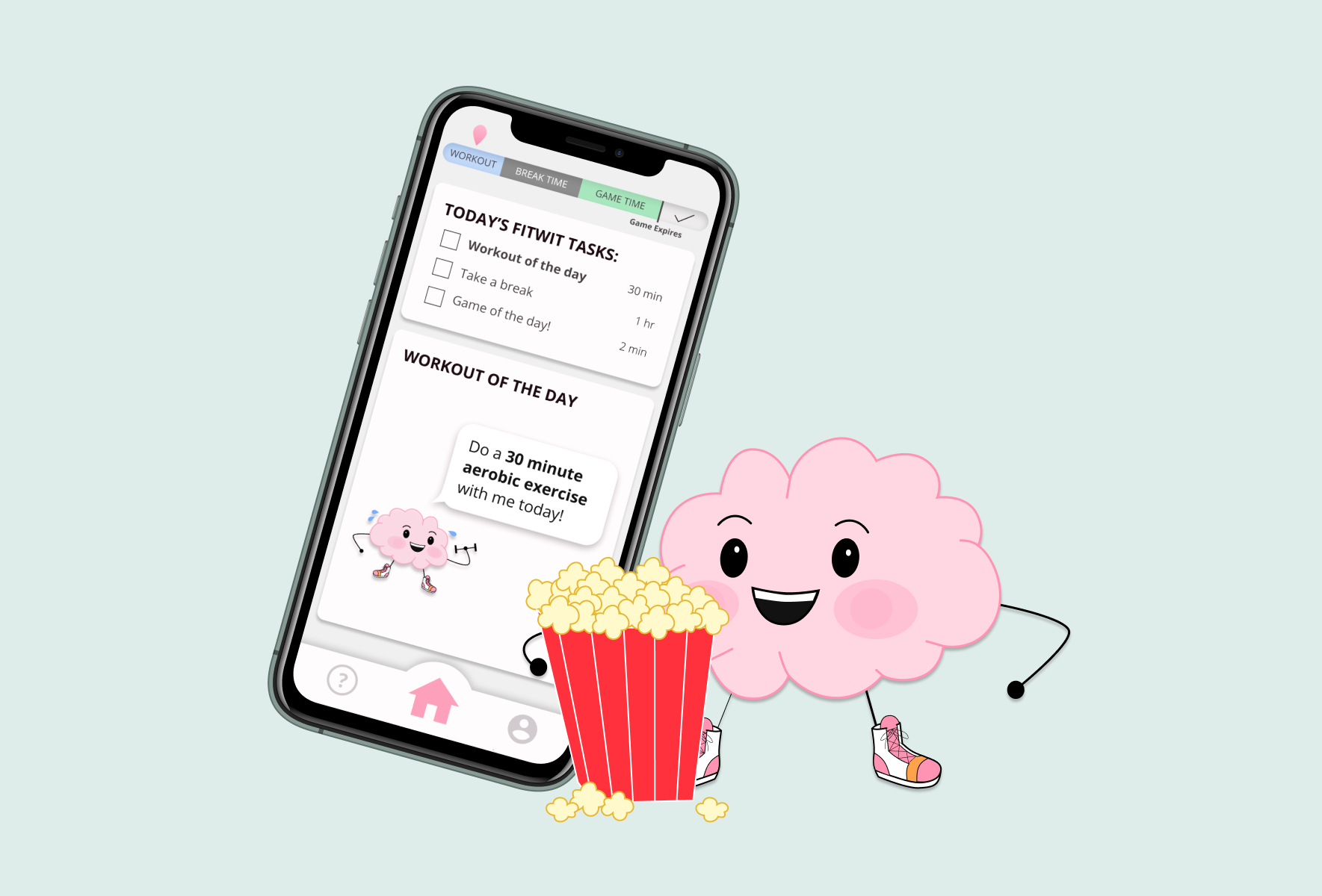
I sought to bring some consistency to our app, so I thought of some new ways to visualize the four different user states. In our early iterations, we had several different timers and progress bars; I decided to consolidate them all into a single timeline.
Users also felt blindsided in early iterations by the waiting period between the workout and the game. To give users a better idea of the day ahead, I created a taskbar:

We implemented both of these additions in our final iteration, allowing for a cohesive user experience:

To further complicate the home screen, the FitWit research study alternates between workout days and rest days.
Rest days (which we decided to call “lazy days”) meant a totally different user experience with only two home screen states: (1) user prompted to play the game and (2) user congratulated for completing the game.
To maintain the app’s consistency, we kept the taskbar for lazy days and added a “lazy” Brian eating popcorn.

Finally, in case a user encountered some interruptions that might undermine the test result, our partners asked us to prompt the user to report any interruptions after completing a test. We created a pop-up that would redirect users to our help page after completing a test:

02 / 04
GAME DESIGN
CHALLENGE: ADAPTING PSYCHOLOGICAL TESTS INTO FUN, INTUITIVE GAMES THAT MEET EXPERIMENTAL RESEARCH STANDARDS
We were tasked with adapting cognitive memory tests to a mobile game platform. Our partners gave us a brief description of tests that they’d used in a prior research study.
My team divided the games, so I worked on the spatial memory test, which we renamed “Tip Top Shapes.”
Our partners gave us the following guidelines for Tip Top Shapes:
The participant is shown a random number of shapes arranged in a certain position on the screen. They are then given all shapes and asked to drag them back to where they were initially.
After many stages of iterations, I came up with this version:

I really liked this iteration because it featured a cute, intuitive, gamified design. However, I learned that it didn’t quite meet research standards after presenting it to our partners. First, my snap-grid format was too far from how our partners had previously conducted the test: they had asked users to drag the shapes freely back to anyplace on a screen. Second, the shapes were too simple: traditional spatial memory tests demand relatively complex shapes. And third, while the location of the shape directory on the right-hand side of the screen maximized the use of space, our partners noted that the narrower game space could interfere with the study.
Limited by these research requirements, I went back to the drawing board and reworked the game to standard.

and voila! In addition to our partners’ edits, I created more complicated shapes that reflected FitWit’s playful vibe and removed the timer (user testing found that it was (a) distracting and (b) unnecessary).
As a team, we also built out the other games which tested vocabulary word memory and foreign language retention. Check out our prototyped Figma for these games and Tip Top Shapes:
Foreign Frenzy: foreign language memory
Tip Top Shapes: spatial memory
Word Whiz: vocabulary word memory
03 / 04
MOTIVATION
CHALLENGE: KEEPING STUDY PARTICIPANTS MOTIVATED
Early on, we realized keeping college-aged users fully engaged in our app for three weeks would be a challenge.
As a team, we identified three key methods to keep study participants from slacking:
Styling: we wanted our app to feel uplifting and cute to breath life into a mundane psychological experiment
Gamification: we designed our tests less like tests and more like games
Rewards System: we wanted to incentivize our users monetarily
I thought it would be cute to have a FitWit character guide (kind of like the Duolingo owl). So I drew up some sketches of a brain and named him Brian.

My earliest Brian sketches
My team really liked Brian, so we adopted him as our FitWit mascot.
I crafted the final vector renditions of Brian:
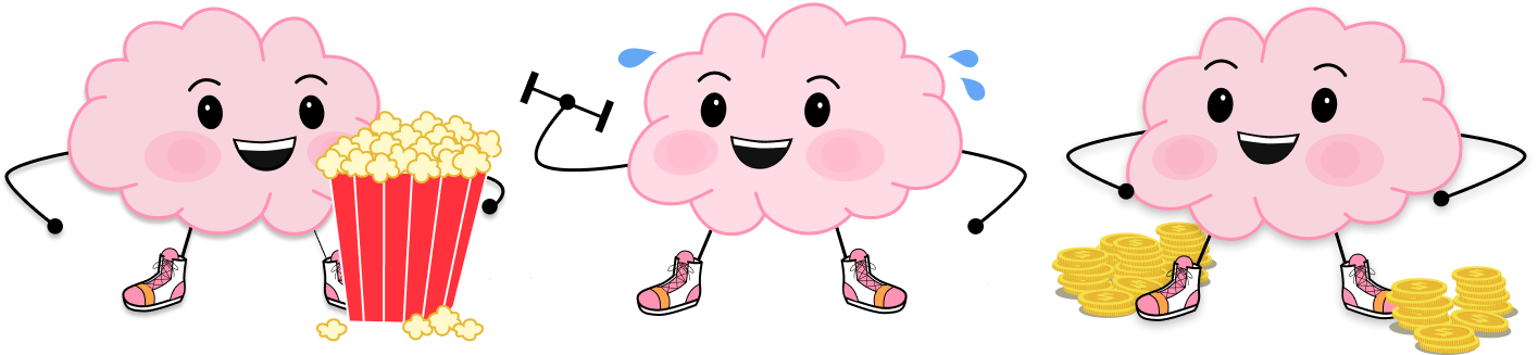
I created many different vectors of Brian to bring him to life including: workout Brian, lazy Brian, rich Brian, nerd Brian, and wizard Brian.
User testing showed that Brian was a fan-favorite, so we implemented each version of Brian to serve a different purpose in our final app.
Brian doing things throughout the app!
Brian added a personal touch to FitWit, but on his own he couldn’t keep our users coming back to an app catered entirely toward experimental purposes. We asked our partners to offer compensation for committed users, and created a profile page for users to track their FitWit progress:
I devised a FitWit rewards system so that users could be rewarded for their FitWit commitment:
Users earn “WitCoins” that are redeemable for cash
Earning enough WitCoins allows users to level up to (a) pro, (b) wizard, and (c) royalty
Leveling up awards the user additional bonuses

04 / 04
A FEW THANK YOU’S !
I would like to thank my incredible team at DALI for making FitWit come to life. A special thank you to Professor Lorie Loeb, who guided me through the principles of design and through life in general.
And finally, a sad farewell to Professor Bucci, who passed away in October. Best wishes to your family. You were an inspiration.